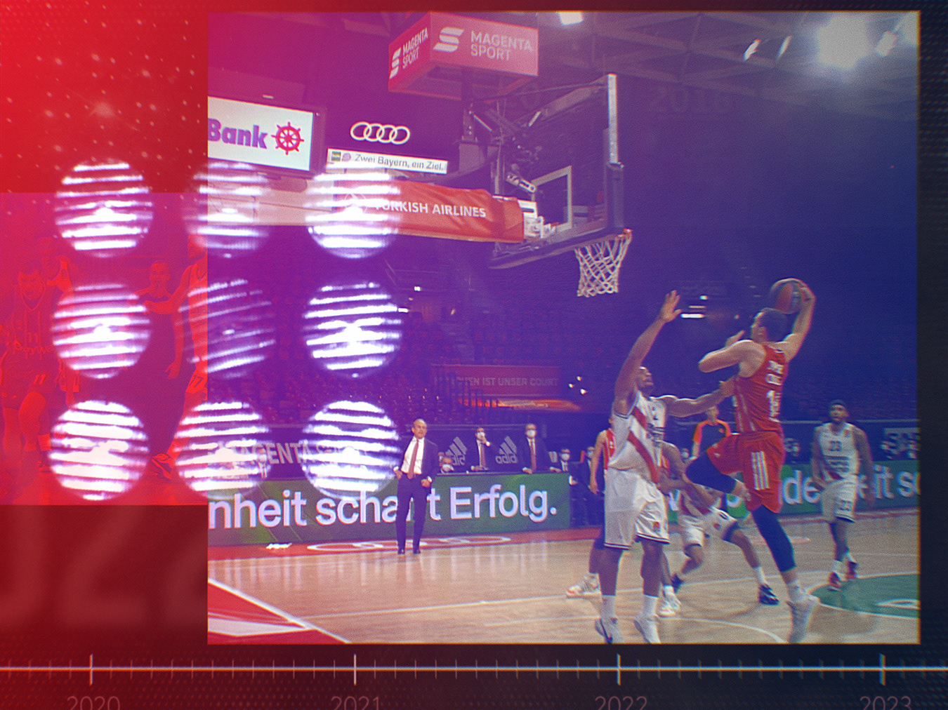
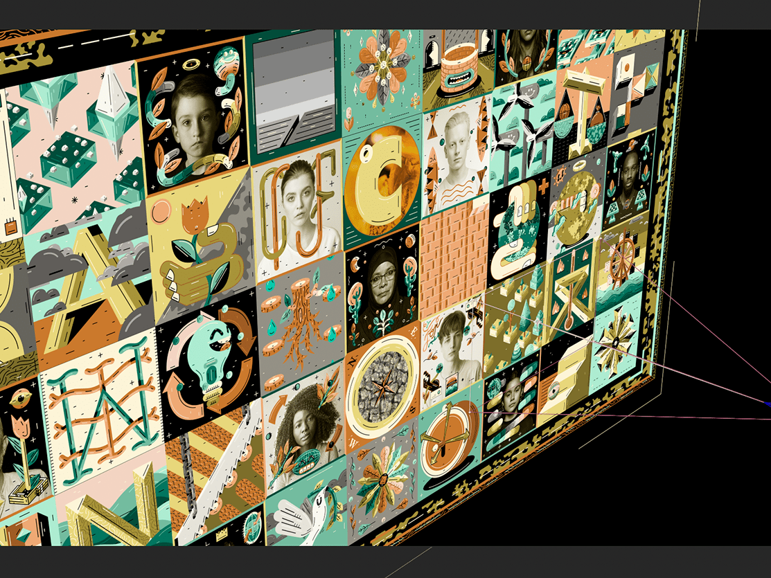
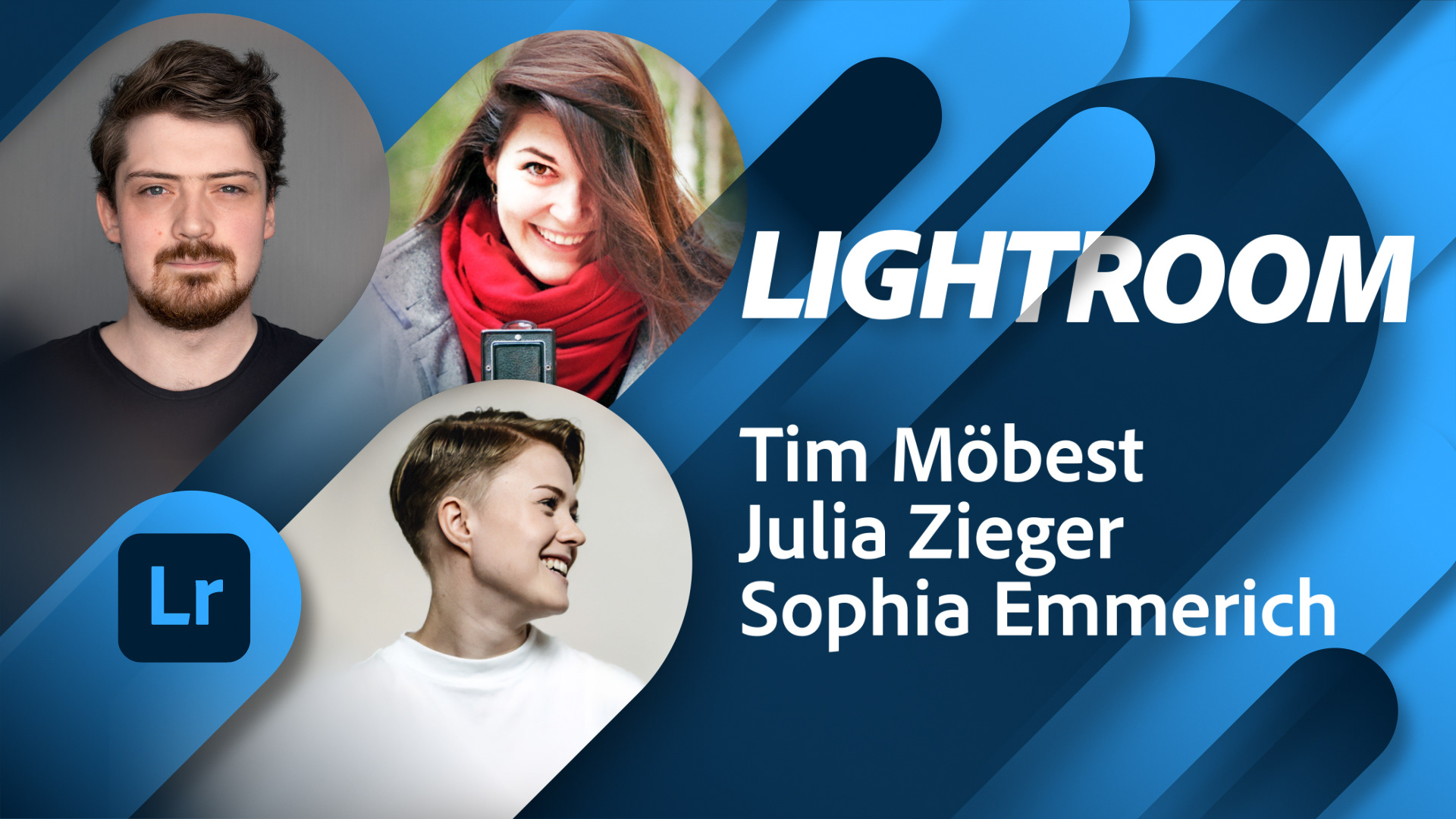
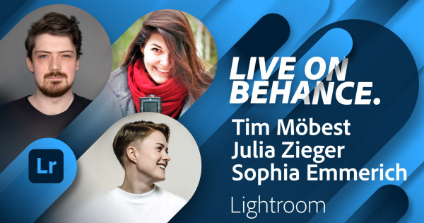
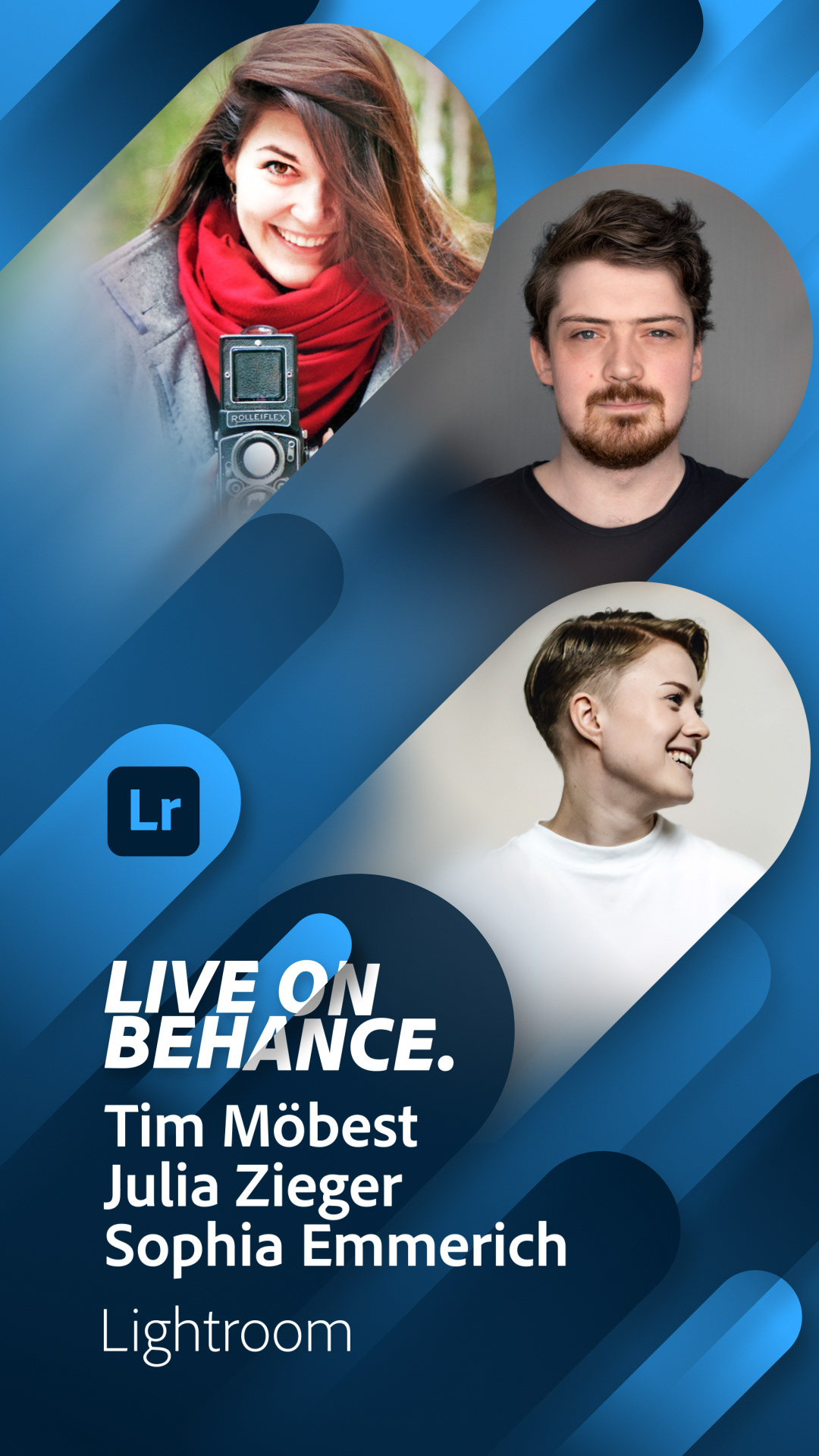
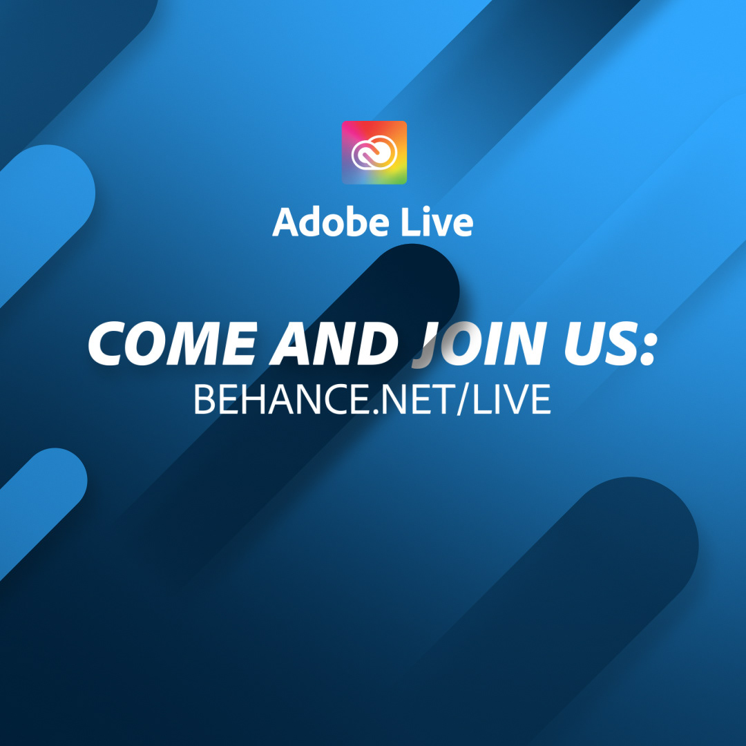
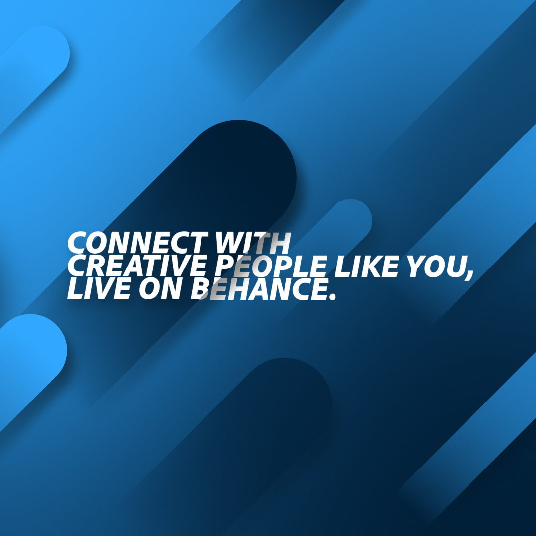
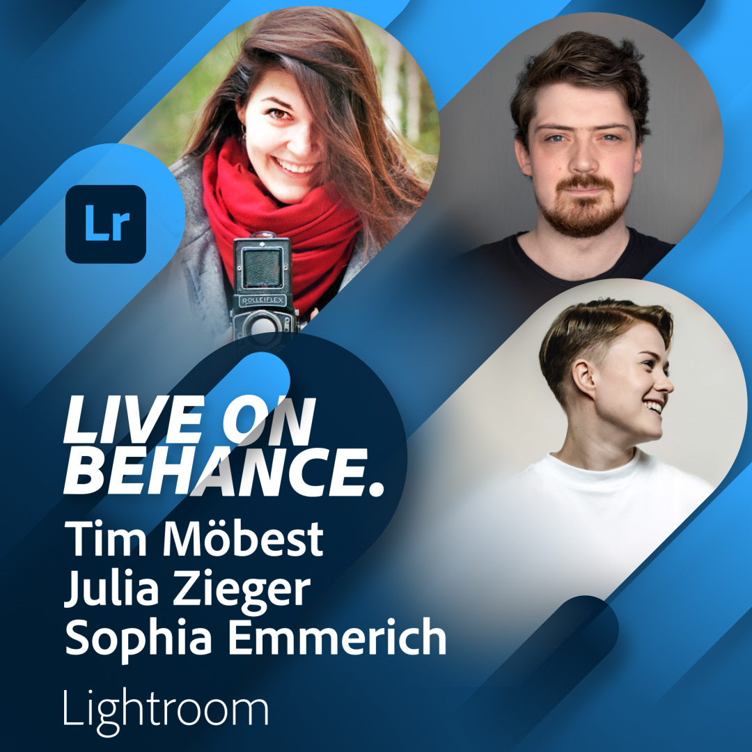
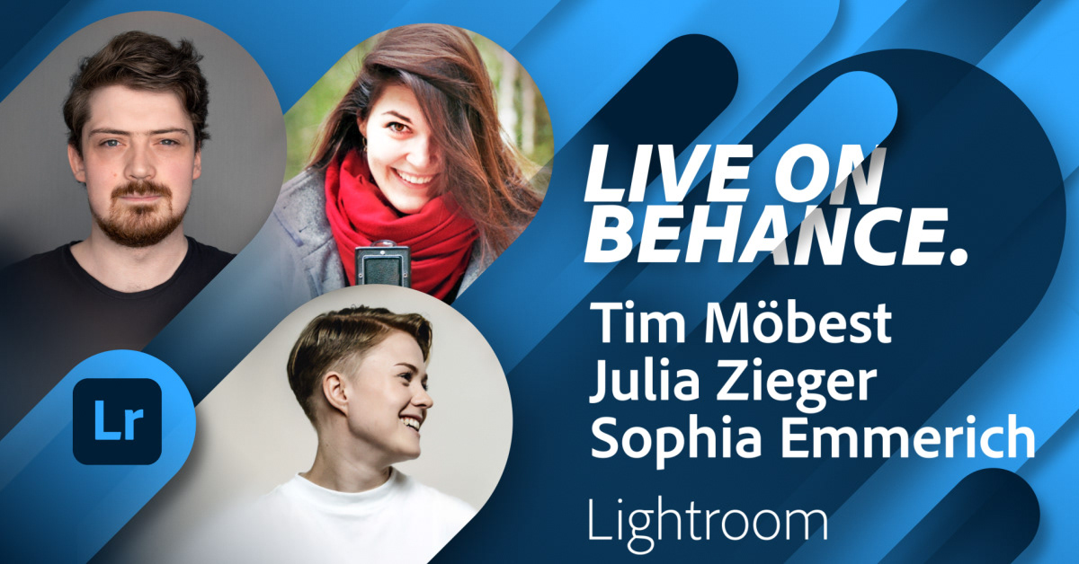
One of the main challenges of this exciting project was to create a design that can work with multiple different combinations: varying number of guests and show hosts, with or without artwork, different themes and last but not least in three different languages. All this has to work in multiple output formats, like 1x1, 9x16 and 16x9.
After all, simple shapes and a strict color palette were the guiding principles to create a simple but yet fresh new design that can tackle all the requirements.
___________________________________________
DESIGN
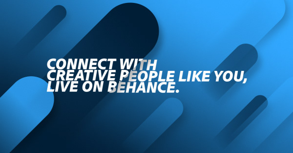
Inspired by ice cream we decided to have diagonal shapes that are dynamically colorized depending on the theme of the show or the product. We went for a diagonal design from the lower left to the upper right to convey positivity, optimism and excitement. In essence visualising the viewers that are inspired, improving and expanding their skillset - the goal of each and every Adobe Live Show.

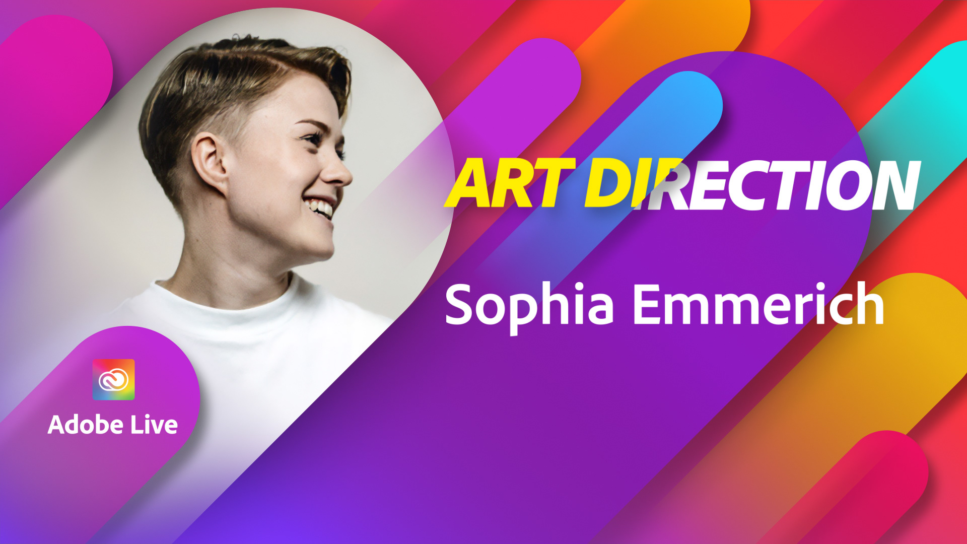
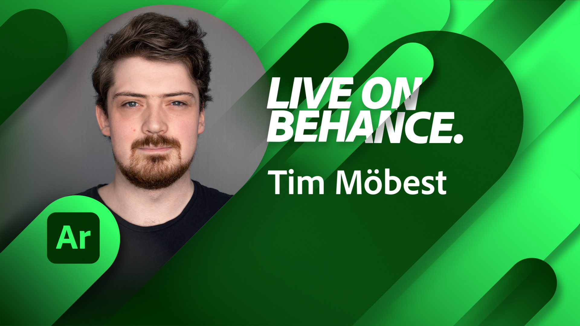
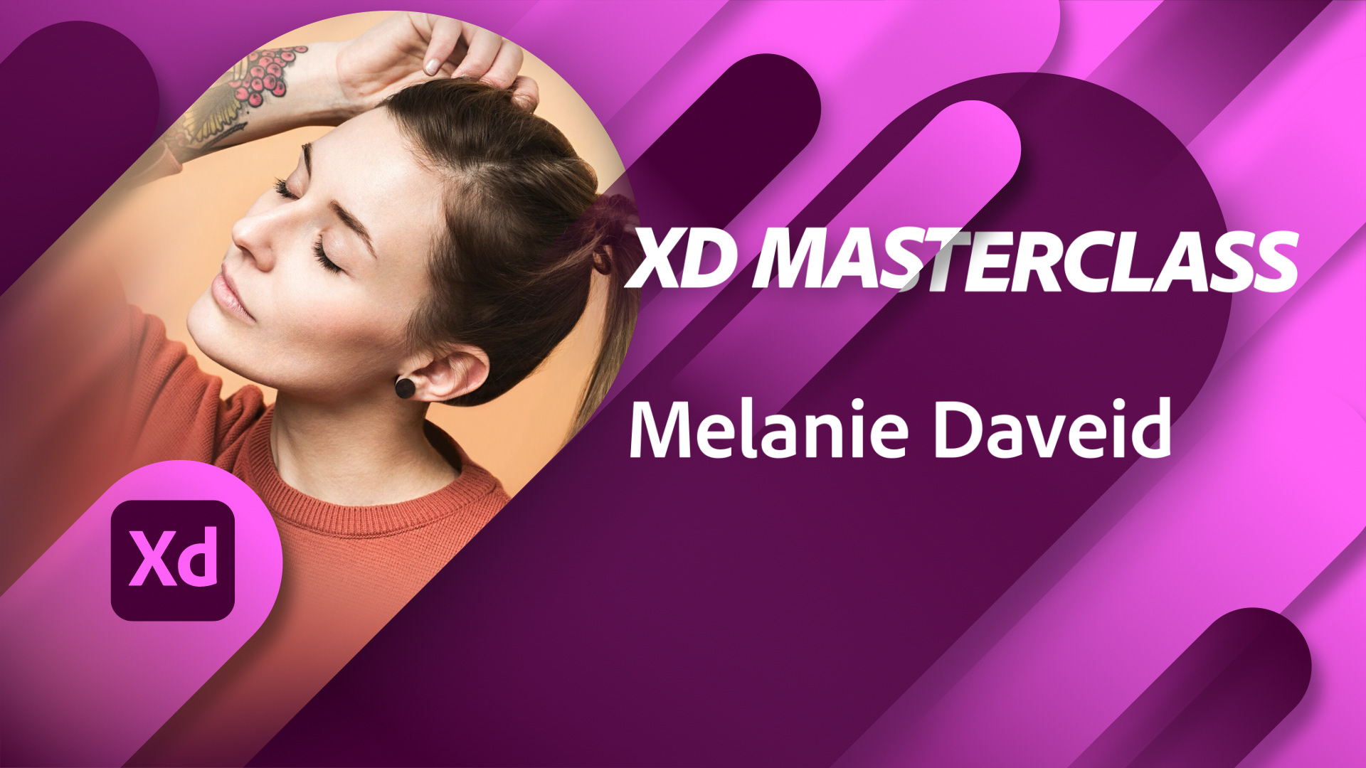
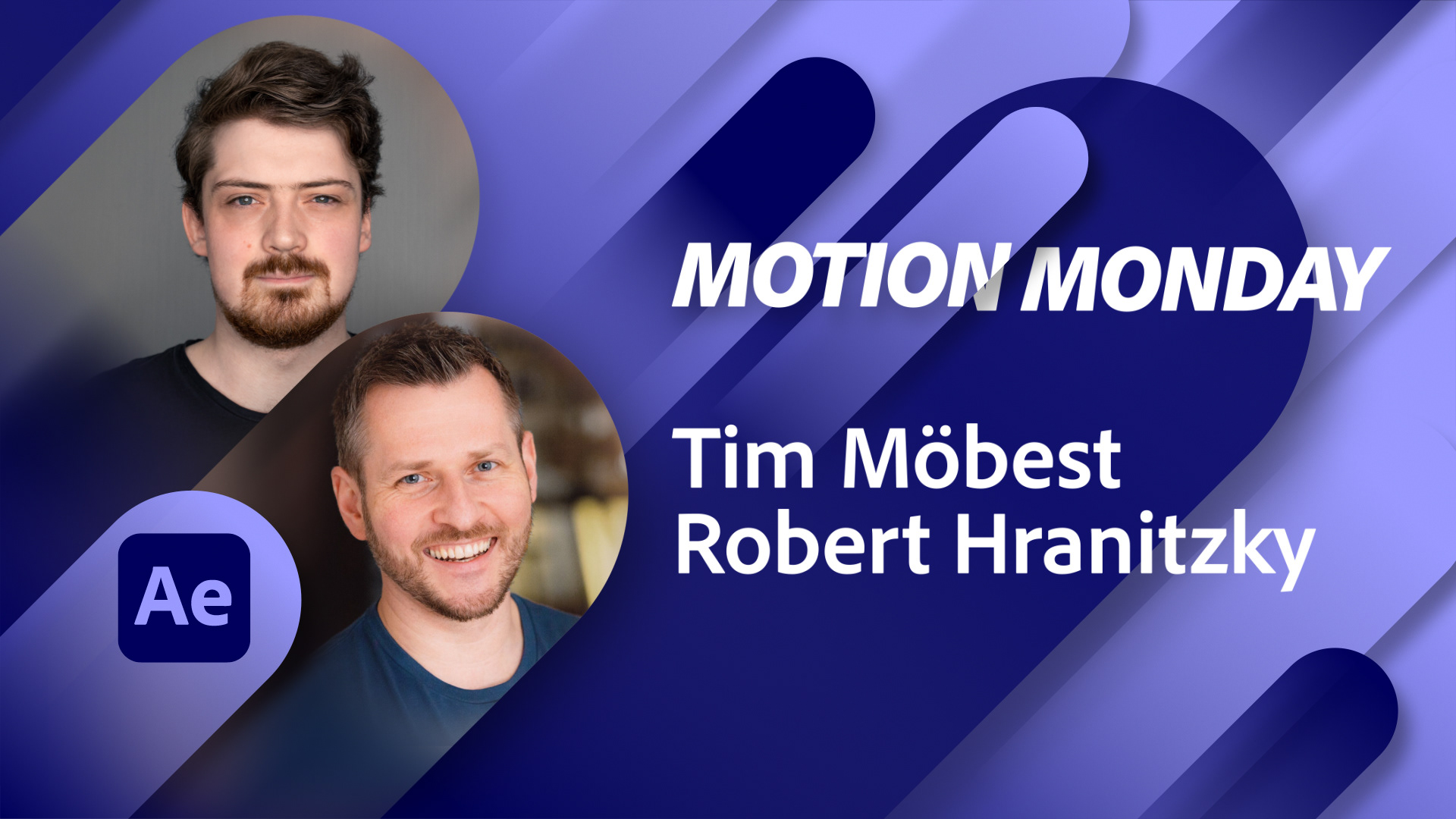
___________________________________________
One of the main tasks - next to a fresh new design - was to have an easy to use and flexible system to regularly update multiple assets in multiple languages (in multiple formats including animation). We used Adobe After Effects with a massive amount of coding, expressions and a few dirty tricks to create a custom toolkit that can be easily controlled via the Essential Graphics Panel. With just one click all necessary assets will be exported and are ready to be shared.
To accommodate a wide and varying range of images and formats, we developed a system in Adobe After Effects that allows for easy adjustments that will always lead to a visually fitting and high-quality look.
Toolkit
______________________________________________________________
The Essential Graphics panel is at front and center of changing and updating the assets. Easy to to use drop-down menus and an automated dynamic layout system maintains the new visual language - no matter if one or up to four different hosts/guests have to be included. Text is scaled dynamically depending on it's length.
___________________________________________
Each tool category is color coded according to Adobe's product color guidelines and can be combined with multiple choices. The app selector dropdown automatically places the selected app icon.
___________________________________________
Credits:
Client: Adobe
Creative Director: Robert Hranitzky
Design & Animation: Kays Khalil, Qusai Sakhr
Ae Toolkit Development: Max Iglesias
Multilanguage Teaser Editing: Michael Münch
Special Thanks: Can Amirak (for his coding sorcery)
